UI rices - Part 5
Hey,
a lot has happened since my last UI rices post. I’ve switches OS on my desktop and phone and there is a lot of new stuff to see.
And - my new theme is called Kobold.
Arch Linux GNOME
I’ve switched from Artix to plain Arch due to usability and simplicity reasons. I don’t hate systemd, so I hadn’t much a reason to stay on Artix. And change is always nice!
I used the switch to also try out a new desktop environment. I used GNOME 3 for a short time on Ubuntu and I hated it. However, I’m really interesed in the DE since the 40 version as they are doing stuff that is very innovative.
A couple of things were a kind of hassle to set up and some very random bugs were here and there which turned out to be just misconfiguration. However, now I genuinely LOVE GNOME on a laptop. The touchpad gestures are very smooth and play well together with the well-thought virtual desktop implementation. And the super key with the global search is just phenomenal. I already always launched programs by hitting the super key and searching in KDE, so the GNOME version matches my workflow exactly.
It is also worth mentioning that I have some extensions enabled, most notably “Blur my Shell”, “Caffeine” and “Date Menu Formatter”.
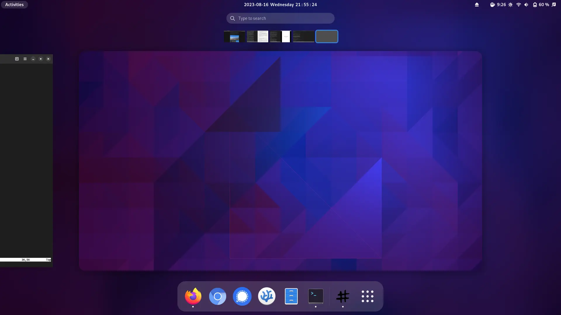
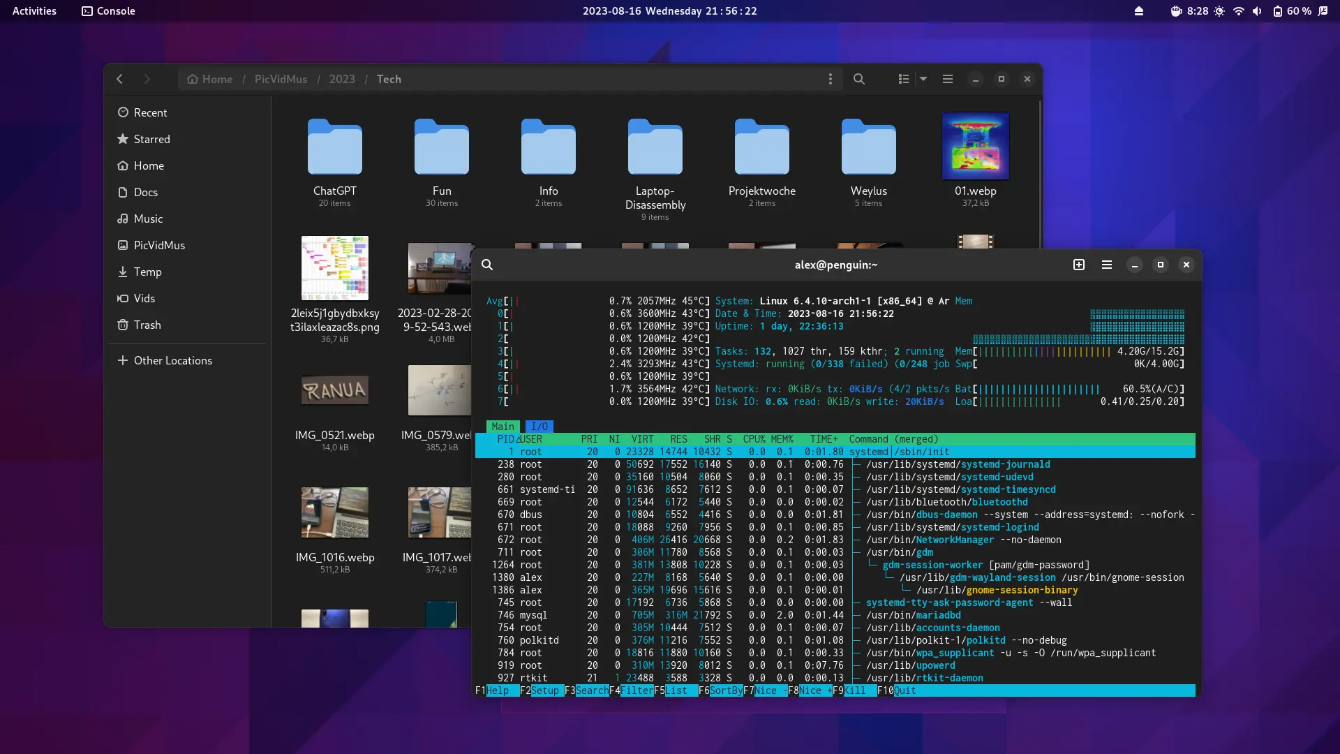
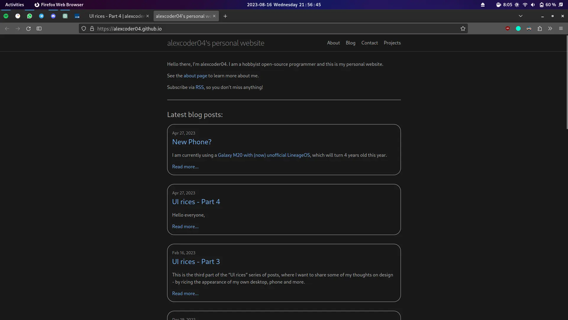
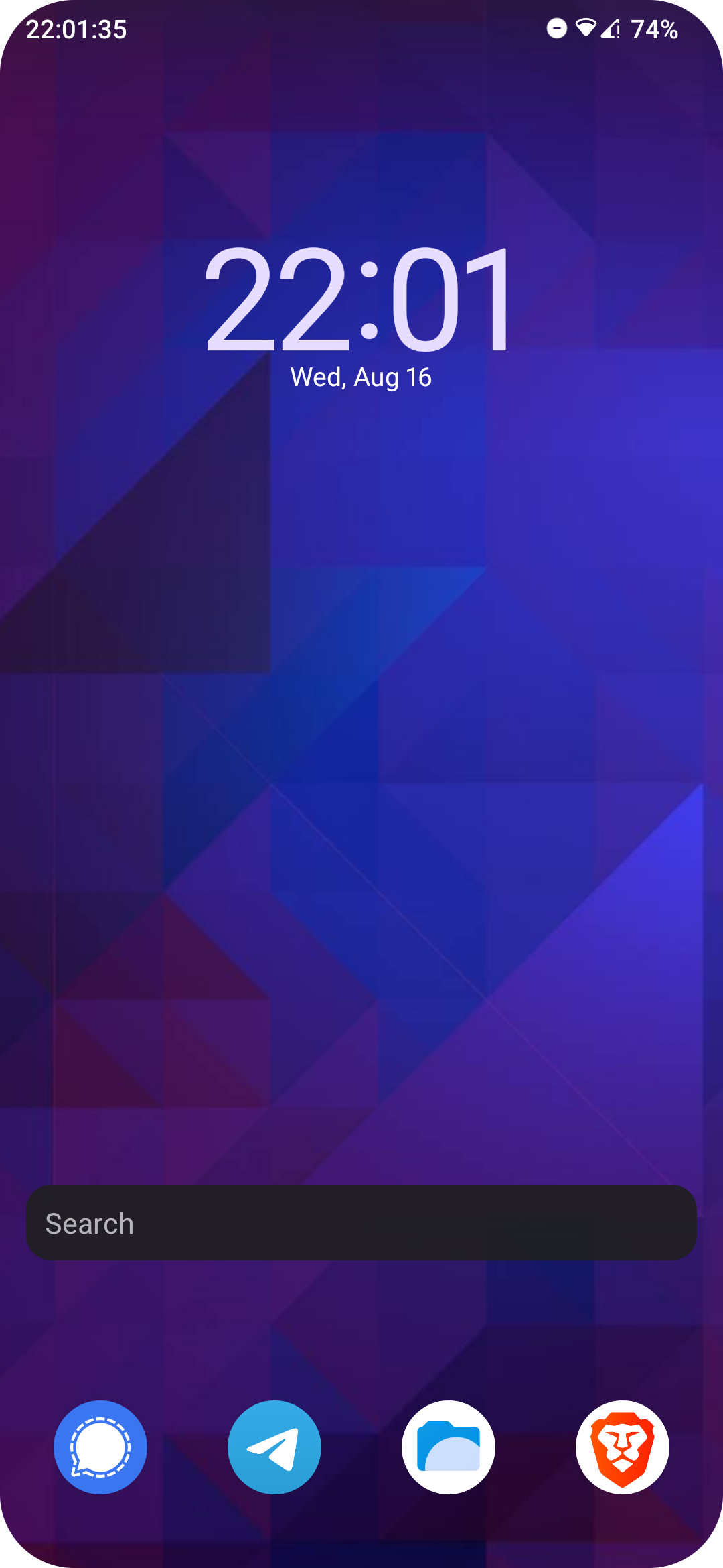
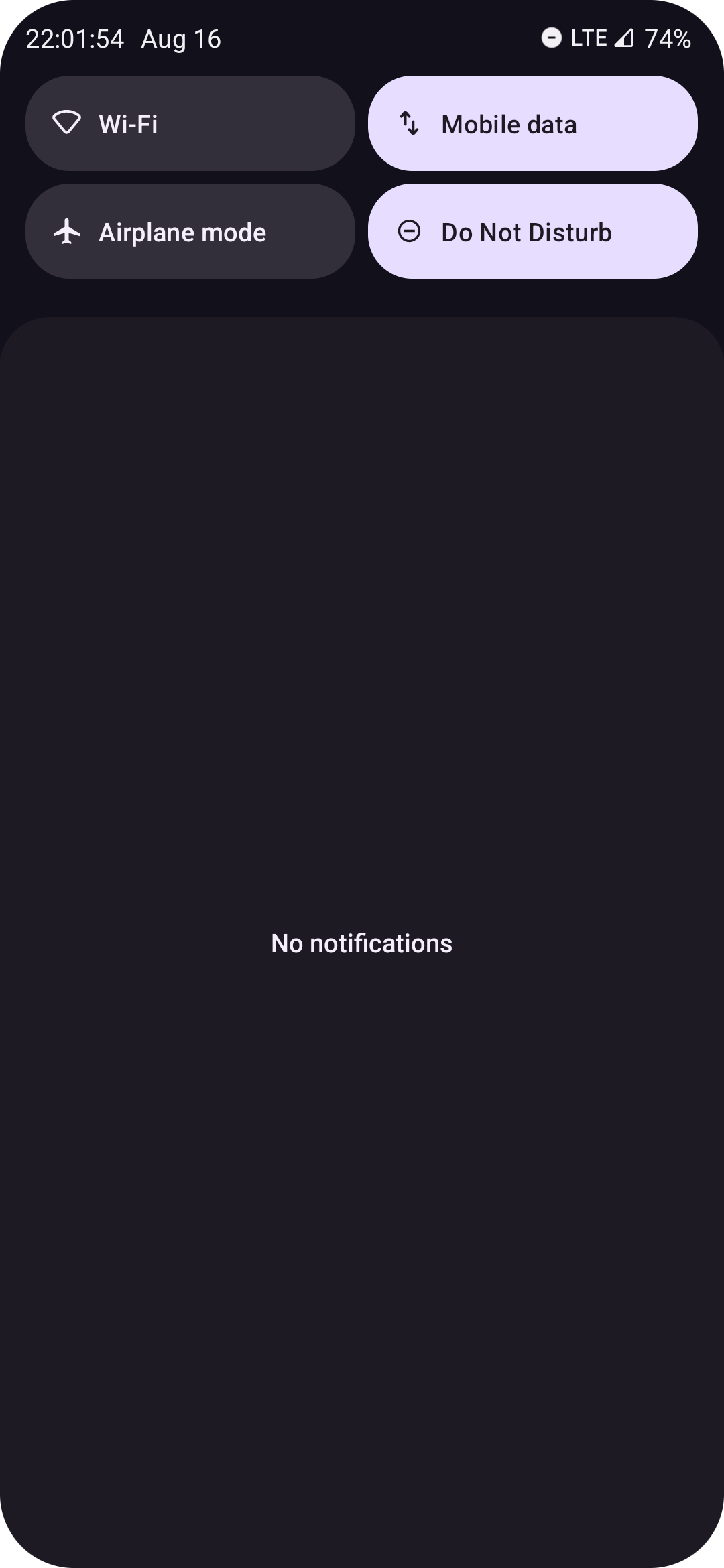
Android 13
For some time, I used the LeafOS ROM, which is also maintained my SamarV-121.
However, something went a little wrong during an update. so I switched back to (unofficial) LineageOS.
My home screen is still pretty clean, however I added a clock this time.
iPad (iOS 16)
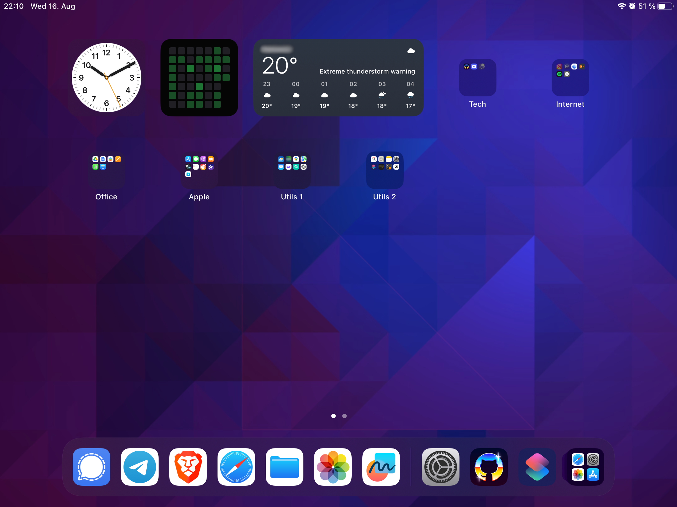
There is actually a rather big update on the iPad side this time. The wallpaper is of course the same one, from the GNOME wallpaper pack, however, I sorted all my apps into categories to keep everything tidy.
Comment on this post
Return to main blog page