UI rices - Part 3
This is the third part of the “UI rices” series of posts, where I want to share some of my thoughts on design - by ricing the appearance of my own desktop, phone and more.
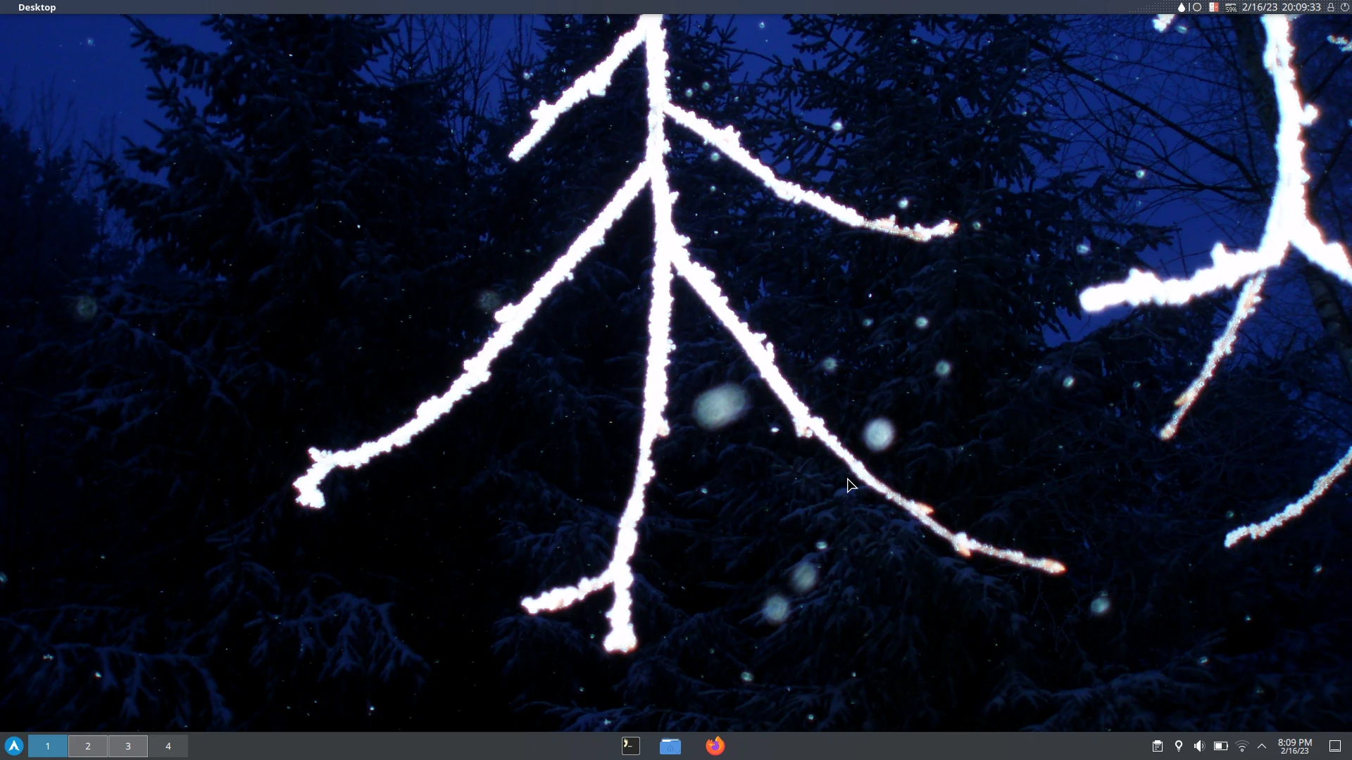
As the winter continues, I’m using a winter-inspired theme I called “Blue Frost”.
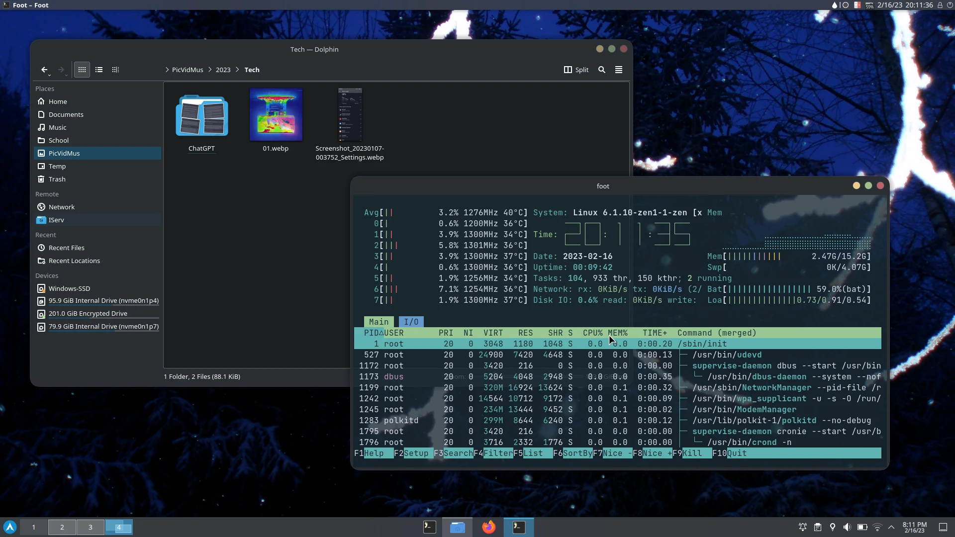
Artix Linux KDE
I switched back to Artix, although now with a full-fledged desktop. I’m trying KDE for the first time and I’m very happy with it. The customizablity is amazing and even overwhelming and I’m not even using a fraction of what KDE offers.
I run KDE in the Wayland session, with a bottom taskbar, which replicates my previous Cinnamon layout - start menu and desktops on the left, applications in the center and system tray on the right. However, now I’m also using a top bar with a macOS-like global menu, window title and some quick buttons. The window titlebar and the task bar disappear in the maximized view to save space, which works very decently, especially in applications like Libreoffice.
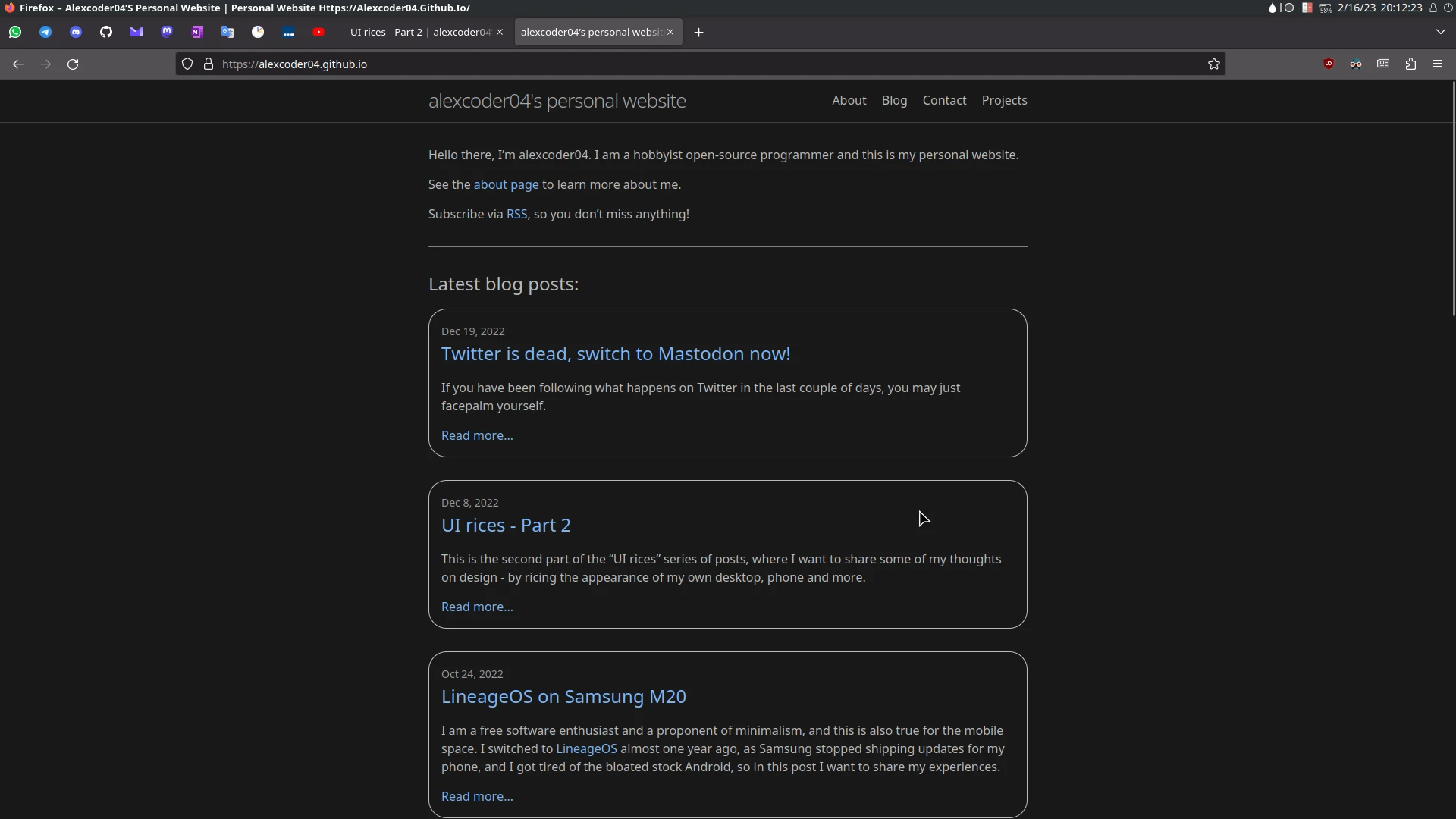
The application theme is just Breeze, combined with Tela icons and Dexy-Dark-Colors-Aurorae window border (looks like macOS again, but with window buttons on the left, where they actually belong). My foot terminal features ann oceanic-next colorscheme, and Firefox is in its default dark theme.
As for the background, I use an iconic 10-year-old winter picture from my personal photos collection.


Android 13
My phone is still on the unofficial version of LineageOS 20 (Android 13) made by SamarV-121.
I’m using the same wallpaper as on the desktop and automatically picked accent colors. The default Trebuchet launcher with a clean home layout serves its purpose.


iPad (iOS 16)
Although there is nothing to customize on an iPad, except of the wallpaper and app grid layout, I will still include it here for completeness.

Comment on this post
Return to main blog page